Painting and Colour #1
Painting and colour, a big topic and one bigger than a single blog posting.
I feel there are several elements to mastering colour, the first is to learn some basic colour theory, understanding colour wheels, complementaries and perception and the often overlooked second point is quality paint, there is an inverse relationship between the quality of your paint and the ease with which you will be able to match colours and mix them accurately and consistently. The purer the pigment and the more of it in the tube, the more vibrant and 'real' your mixed colours will be.
However this post is about a practical exercise any level of painter can do and gain some benefit from. For the beginner it is a head long plunge into hardcore colour experimentation and for the seasoned professional it will hone their skills. This is about creating colour charts, and I have to pay gratitude to Richard Schmid in his book Alla Prima for providing the guidelines.
Basically the idea is to select the most used colours of your palette, you can choose any amount, however the process may take a very long time if you choose over ten, and you mix each colour with the other in a very precise way giving a massive range of all the possible combinations of the colours you have chosen, this will become clearer as I write more about the process.
It is worth painting onto a soild, durable material as these charts make a fantastic reference for colour matching in the future. I used hardboard, which works out very cheaply if you buy a big sheet and cut it down, I get mine in B&Q and if it is a decent sized store they cut the boards for you for free, and each board costs about 40p.
Then it's three coats of white acrylic primer or gesso, now obtain some 1/4" masking tape, I found ebay the best for this however don't buy the blue masking tape as it doesn't stick. Next mask off the board into 1 1/2" squares. If you do a few boards at once all this doesn't take very long.
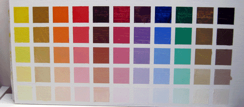
The board above is my cadmium yellow chart.
The first square at the top left is cadmium yellow straight of the tube, it is then taken down in five even steps with the addition of titanium white to practically white with just the barest hint of the original colour, you could use more steps but five works well. An important point to note is this all done with a palette knife, no brushes, you would be forever cleaning your brush and you also get very handy with the palette knife by the end.
Then the second column is cadmium yellow + yellow ochre taken down to practically white in five steps.
Third column cadmium yellow + raw sienna, fourth cadmium yellow + cadmium orange, and so on through the colours you have selected. The idea is the 'primary' colour of the chart dominates the mix, so you never lose sight of it, for example if you are mixing yellow and blue, and yellow is dominant, you will inevitably get green but it should be a very yellowy green.

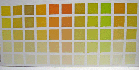
This is an ultramarine blue chart, again the same process top left corner is straight out of the tube, then step down to almost white, second column ultramarine blue + cadmium yellow, and so on. I always found if you do the top square first, then go to the bottom square, the almost white square with just a speck of the mix into white, then you have the two ends of your range, then do the middle and the other two will follow easily.
Yes this is labour intensive, however done with a quiet mind it can be really absorbing and you will learn so much about mixing colour and as a reference it is great. Imagine you have a blue you want to mix, you look at your chart like the one above and instantly you will see which square is closest and know where to begin, and over time this becomes instinctive.
There are a few things to note as you progress;
The beautiful harmonies which emerge on each chart.
White does not merely lighten a colour it changes it, cools it.
The darks are difficult to distinguish between until white is added.
The colours are most vivid in the middle range.
It is completely open to experimentation and I have done many charts of flesh mixes, however it is best to start with a simple 8 to 10 colours and work through them, good luck!